Ans: Bringing teacher collaboration into the grading flow
I redesigned how teachers use Flags and Discussions while grading. After release, Discussions CES increased from 3.0 to 3.4, while Creating Flags increased from 3.7 to 4.1 on a five-point scale.
OVERVIEW
Project snapshot
Ans is an assessment platform used by teachers, students, and administrators to create, grade, review, and manage exams and assignments.
I redesigned how teachers use Flags and Discussions while grading. I owned research synthesis, product design, prototyping, moderated usability testing, and delivery support. I worked with a product manager, a UX researcher, and two developers over three months.
After release, Discussions CES increased from 3.0 to 3.4, while Creating Flags increased from 3.7 to 4.1 on a five-point scale.
I was the only product designer on the project.
I reviewed and synthesized relevant Zendesk feedback, using prior interview findings supplied by our UX researcher to understand the recurring problems. I then designed the new information architecture and interface, created the prototype and testing script, conducted approximately 12 moderated usability sessions with teachers, and supported the two developers through implementation.
The product manager approved the final direction. During delivery, I reviewed the implementation on our staging environment and documented the changes required before release.
CHALLENGE
Collaboration was separated from the work it supported
Teachers use Flags and Discussions when they need help making a grading decision. They might flag an uncertain answer for a colleague, ask for clarification, or discuss a student’s work before finalizing a grade.
These conversations depend on context. A teacher needs to see the grading scheme and the student’s answer to understand what is being discussed.
The existing information architecture made that difficult. The grading page had separate tabs for the grading scheme, Flags, Discussions, and other functions. Moving between them caused teachers to lose sight of the work they were discussing.
This structure had remained largely unchanged for years despite recurring customer feedback.
Zendesk tickets repeatedly described communication inside the platform as difficult. Teachers reported losing context when moving between tabs and asked to see the grading scheme alongside a Flag or Discussion. Previous interviews conducted by our UX researcher showed the same pattern.
Before making changes, we also began measuring Customer Effort Score for both features. This gave us a baseline against which we could evaluate the redesign.
The problem was structural: collaboration tools lived outside the moment when teachers needed them.
Our first option was to keep Flags and Discussions in separate tabs and improve the experience within each one. This would have allowed us to improve the visual hierarchy, make it easier to move between open and resolved Flags, and modernize the interface without changing the grading page’s structure. It was also the safer option: less disruption for existing users, and fewer changes to a mature part of the product.
However, it did not address the main complaint. Teachers would still have to leave the grading scheme to read or respond to a Flag. Improving the interface inside each tab would make the individual features cleaner while preserving the context switching that caused the problem.
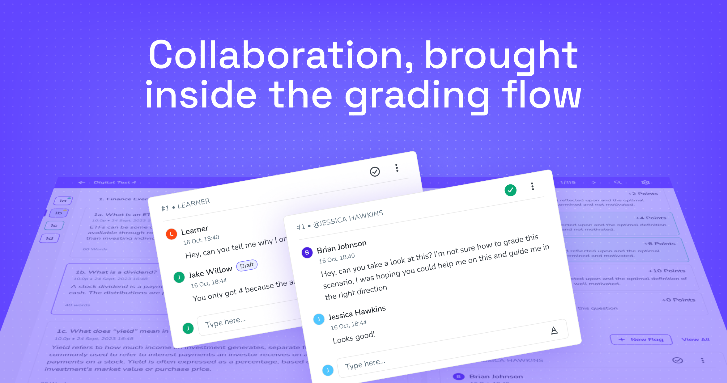
Customer feedback gave us enough reason to reject that direction. We moved Flags and Discussions into the Review tab, alongside the grading scheme and student work. This allowed teachers to communicate while retaining the context behind the grading decision. The new direction simplified the navigation and treated collaboration as part of grading rather than as a separate destination.
Decision: Place Flags and Discussions inside Review.
RESEARCH
Testing the interaction model with teachers
I created a high-fidelity prototype and wrote a task-based usability-testing script.
I conducted approximately 12 moderated sessions with teachers who could encounter Flags and Discussions in their daily work. The sessions focused on realistic actions rather than asking participants whether they liked the redesign.
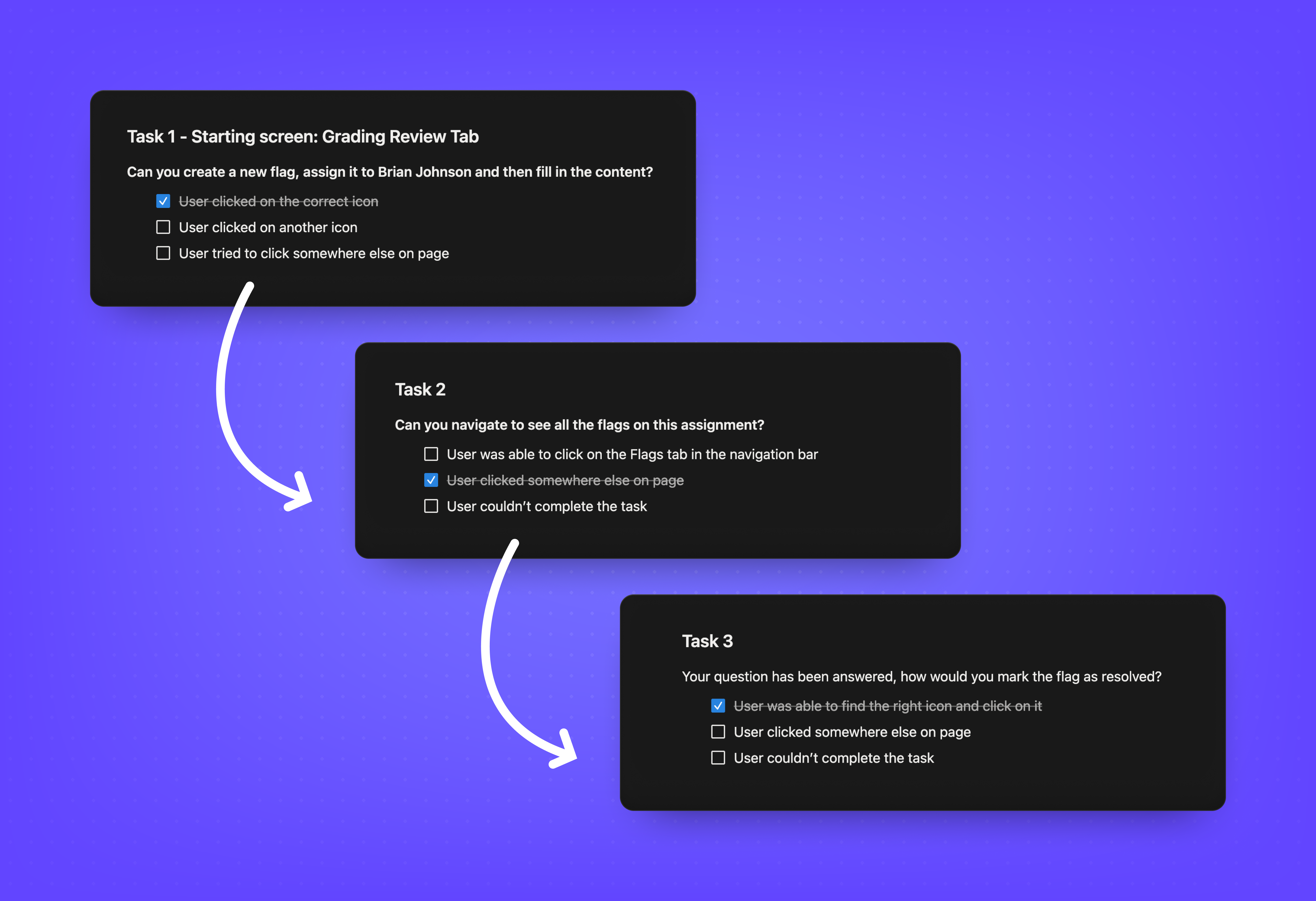
Participants were asked to complete the tasks below. The sessions helped me evaluate whether teachers could understand the new structure, find the available actions, and move between different Flag states.
Two issues stood out.
First, the icon used to resolve a Flag was not clear enough. Participants could complete the task, but the hesitation showed that discoverability could not depend on iconography alone.
Second, teachers identified a consequence of moving Flags and Discussions into Review: a long grading scheme could push the collaboration content below the viewport. A Flag could exist on the page without the teacher realizing it was there.
That second issue exposed the main tradeoff in our direction. We had kept the grading context visible, but the additional content made the page denser and created a new visibility problem.
- 1
Create a Flag, assign it to a colleague, and add content.
- 2
Find all Flags associated with an assignment.
- 3
View open Flags.
- 4
Mark a Flag as resolved.
- 5
Delete a Flag.
- 6
Open a Flag to see its details.
DIRECTION
Keep collaboration visible below the fold
We did not want to undo the new information architecture. Keeping Flags in separate tabs would restore the original context-switching problem.
Instead, we designed an indicator that appeared when an unresolved Flag existed below the current viewport.
The component told the teacher that there was “1 unresolved flag.” Selecting it automatically scrolled the page to the relevant Flag and highlighted it in yellow for a few seconds.
This gave teachers awareness of content they could not currently see while preserving the grading scheme and collaboration tools within the same page.
This became one of the most valuable outcomes of usability testing. The sessions did more than validate the proposed structure. They exposed a new problem created by the direction and gave us time to address it before release.
Rejected option
Keep the existing tabs and redesign each feature in isolation
Design decision
Place Flags and Discussions inside Review. A visual and navigational improvement inside the existing structure would not solve the loss of grading context. Tradeoff: bringing more functionality into Review increased the page’s density.
Rejected option
Move Flags back into a separate destination to avoid page density
Design decision
Add an unresolved-Flag indicator for content below the viewport. Moving Flags back would reintroduce the loss of context identified in customer feedback. Tradeoff: another interface element and a short guided interaction on an already complex page. Result: teachers could remain in the grading context while receiving a clear signal that an unresolved item required their attention.
SOLUTION
Building within the product system
The redesign introduced new components and interaction patterns for Flags and Discussions. These were built on the foundations of the custom Ans design system I had established previously.
Prototyping the interaction model
I used a high-fidelity Figma prototype to make the redesigned Review flow tangible before development. The prototype supported the moderated sessions and helped answer practical questions: Would teachers notice the new Flags entry point? Would they understand where to find all Flags? Could they distinguish between open and resolved Flags? Were actions like resolve, delete, and open clear enough?
Reusable patterns and delivery constraints
The work also produced reusable patterns for text fields, assigning an item to another person, open and resolved states, status indicators, and contextual navigation to content below the viewport. These patterns could support future features instead of remaining specific to this redesign.
The collaboration with engineering was smooth, and there was little resistance to adding the required components. The established design-system foundations gave us a shared starting point for implementation.
We still had to control the project’s scope. We limited some micro-interactions to complete the work on time. We also made few improvements to notifications for users mentioned in a Flag or Discussion because the required backend changes fell outside the project.
The redesign improved the in-product workflow, but it did not fully solve how teachers were notified outside that context.
Delivery and design QA
I supported the two developers during implementation and reviewed the completed work after the pull request reached our staging environment.
I compared the staging implementation with the Figma designs and created a list of issues to address before release. Most differences were small, including spacing and visual details. We fixed the issues that affected the experience and accepted some minor spacing differences to keep the release moving.
This review helped preserve the intended hierarchy and interaction behavior without treating visual parity as more important than delivery.
OUTCOME
Measuring the outcome
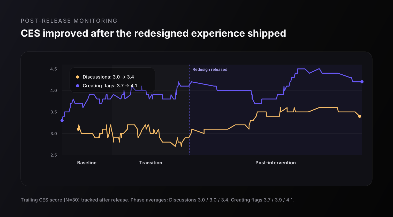
We measured CES specifically when users interacted with Flags and Discussions. Scores used a five-point scale, with five representing the lowest perceived effort.
The measurement included a baseline period of approximately one month, a transition period of around two weeks, and a post-release period of more than two months, with more than 100 responses across the measurement.
The transition period mattered. Teachers initially submitted support requests and complaints as they adjusted to the new workflow. This pattern was common in the EdTech environment, where established processes can be sensitive to change.
Once the redesigned experience stabilized, related support requests stopped and CES improved:
Discussions: 3.0 to 3.4
Creating Flags: 3.7 to 4.1
The 0.4-point improvement was consistent across both areas. Discussions started from a lower baseline, while Creating Flags improved despite already performing more strongly.
The results support the direction of the redesign: keeping collaboration close to the grading context, simplifying the navigation, and improving the surrounding hierarchy reduced the effort teachers reported.
The data does not prove that every improvement came from a single design decision. The transition period, user adaptation, and other product conditions could also have affected the scores. Measuring the feature before and after release still gave us a stronger signal than relying on preference or stakeholder feedback alone.
3.0 → 3.4
Discussions CES (baseline to post-release)
3.7 → 4.1
Creating Flags CES (baseline to post-release)
REFLECTION
What I learned
This project showed how much product complexity can come from separating related tasks.
Flags and Discussions already had useful functionality. Their position in the information architecture prevented teachers from using them effectively during grading. Improving their appearance alone would have left the central problem intact.
Moving collaboration into Review solved the context-switching problem, but it also introduced more density. Usability testing helped us recognize that tradeoff and design the unresolved-Flag indicator before release.
If I revisited the project, I would spend more time identifying adjacent pain points before committing to the redesign. The CES improvement was meaningful, but a broader discovery phase might have revealed further opportunities to reduce effort.
I would also investigate the side panel used to view all Flags and move between open and resolved states. It appears to receive less use than I expected. I would want to understand whether teachers do not need it, cannot find it, or prefer to handle Flags directly within the grading context.
The notification experience also remains incomplete. Backend limitations kept it outside the project’s scope, but communication depends on more than the experience inside Review. A future iteration should examine how teachers discover that someone has assigned or mentioned them in a new Flag or Discussion.