3SS: Designing an EPG across seven platform types
I designed a new Electronic Program Guide for Elisa, then helped turn it into a reusable feature that was adapted for Allente and TCC Uruguay. All three providers launched the feature across a combined customer base of more than 4 million people.
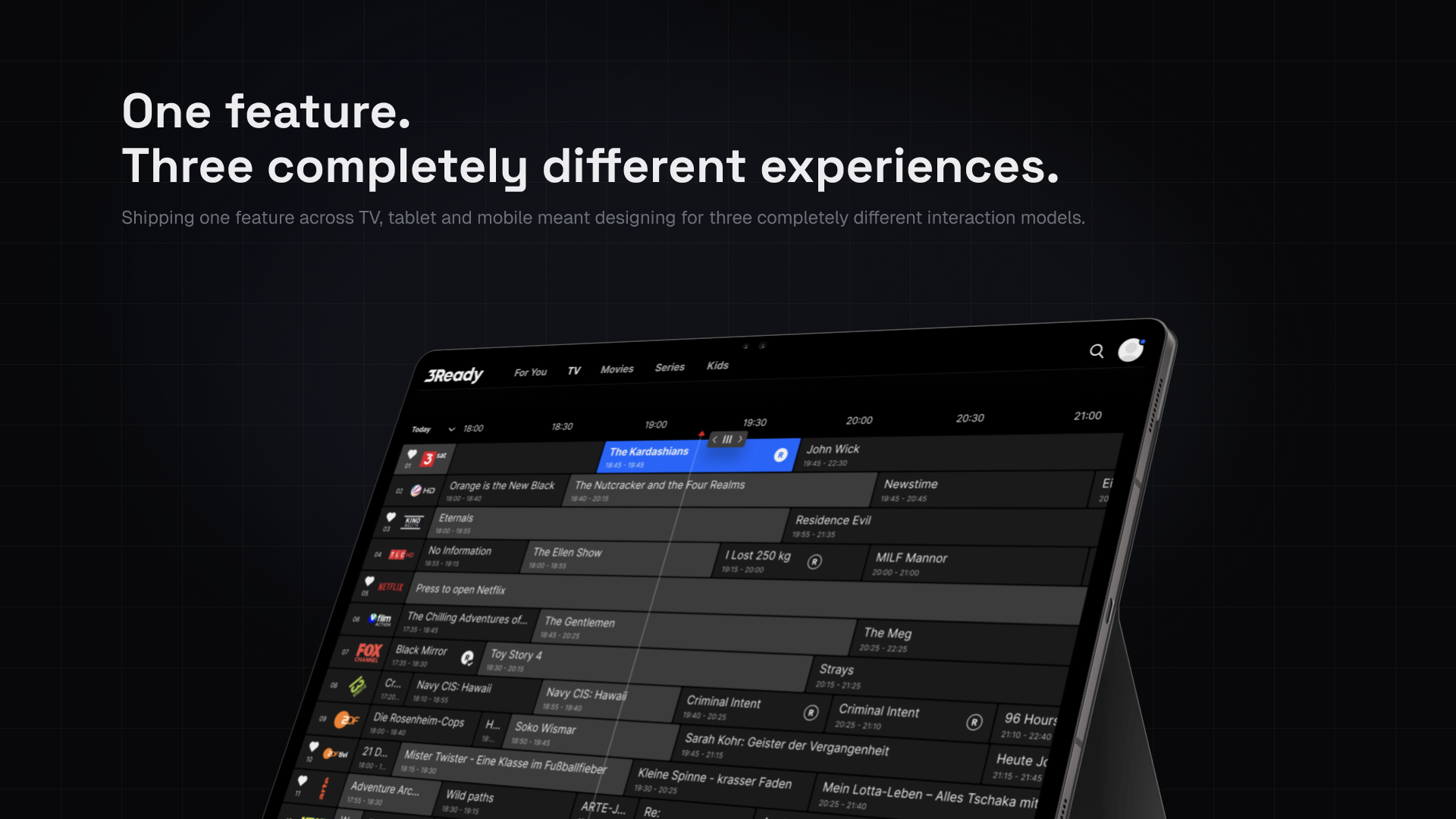
OVERVIEW
Project snapshot
I designed a new Electronic Program Guide for Elisa, then helped turn it into a reusable feature that was adapted for Allente and TCC Uruguay.
The first implementation took approximately two months. I owned product design, prototyping, platform-specific behavior, and design QA across iOS, Android, web, Smart TV, Android TV, Apple TV, and set-top boxes.
All three providers launched the feature. Their products served a combined customer base of more than 4 million people across Europe and Latin America, although we did not receive data showing how many customers used the EPG itself.
I was the only product designer assigned to the project.
I worked with a product manager, a requirements engineer, and seven developers, with one developer responsible for each platform. The external client team included a product owner, product manager, designer, and backend developer.
The client-side designer reviewed branding and visual consistency but did not participate directly in the product-design work.
The product manager and client product owner approved the final direction. I worked closely with the requirements engineer to turn the brief into a solution that could fit the allocated timeline and technical scope.
We planned the work through an Agile process. Before each iteration, PI Planning sessions helped define what we would build and how the feature would behave. I joined daily client meetings, presented design progress, explained the user experience, and incorporated stakeholder feedback.
The project did not include user research conducted by our team. The client had handled research and requested the EPG as a highly demanded feature. I used the client brief, competitor analysis, stakeholder input, prior cross-platform experience, platform conventions, and technical feedback to make design decisions.
That limitation shaped the project. I could evaluate whether the design followed established interaction models and worked correctly on physical devices, but I could not measure whether it improved viewer behavior.
CHALLENGE
A common feature with uncommon implementation complexity
An Electronic Program Guide helps viewers understand what is playing across different channels, move through the schedule, inspect program information, and start watching content.
The concept is familiar. The challenge came from making it work across seven platform types.
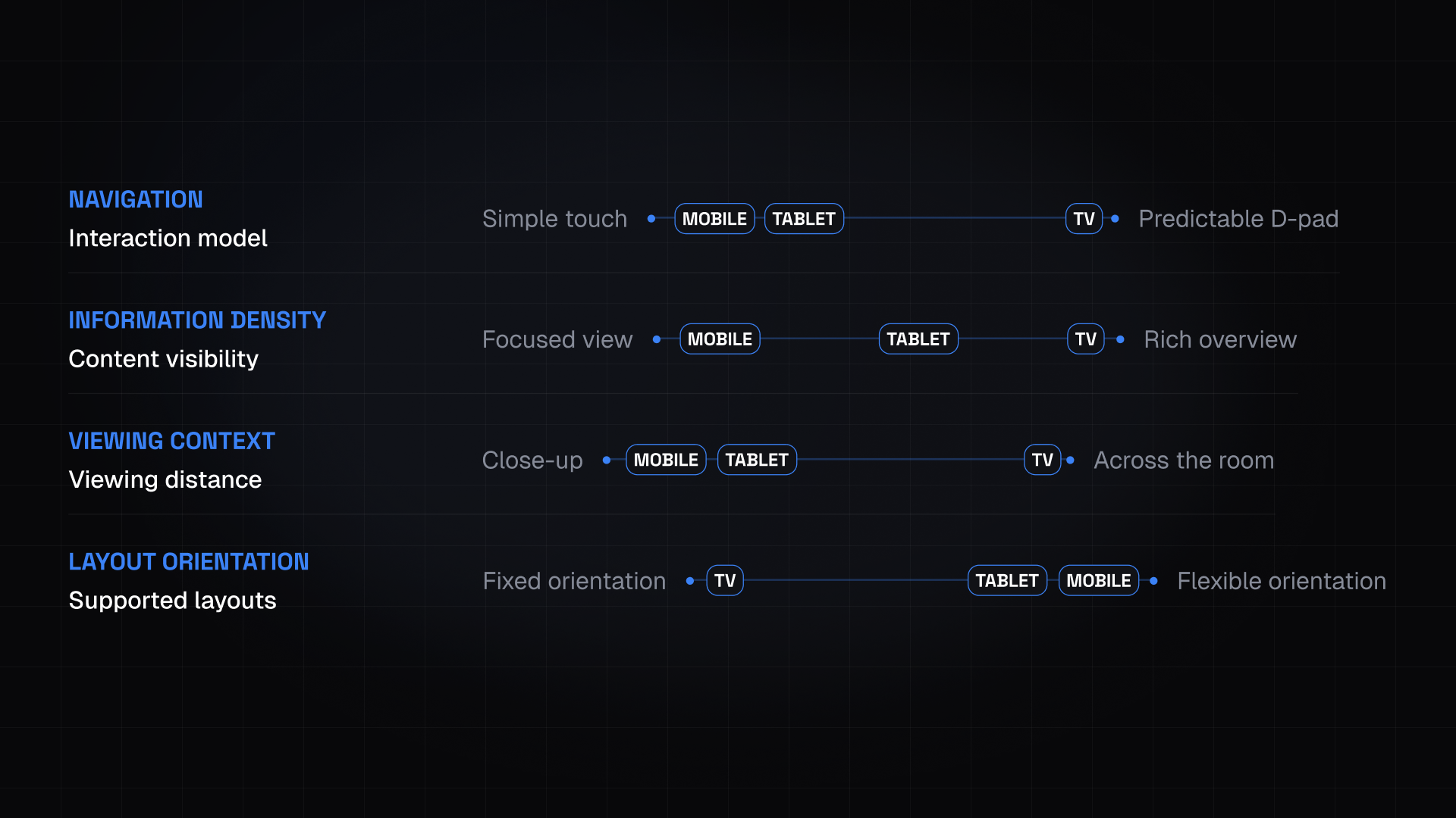
Mobile users navigate through touch. TV viewers use a remote and D-pad from several metres away. Web introduces another interaction context. Each platform also has different expectations around focus, navigation, information density, playback, and orientation.
The first EPG was designed for Elisa. After it launched, parts of its design and implementation were reused for Allente and TCC Uruguay. Each provider brought different channels, content, branding, and product requirements, so reuse depended on separating shared product logic from client-specific presentation.
The feature needed to feel consistent across the product family without forcing the same interface onto every device.
CONSTRAINTS
What each platform changed about the experience
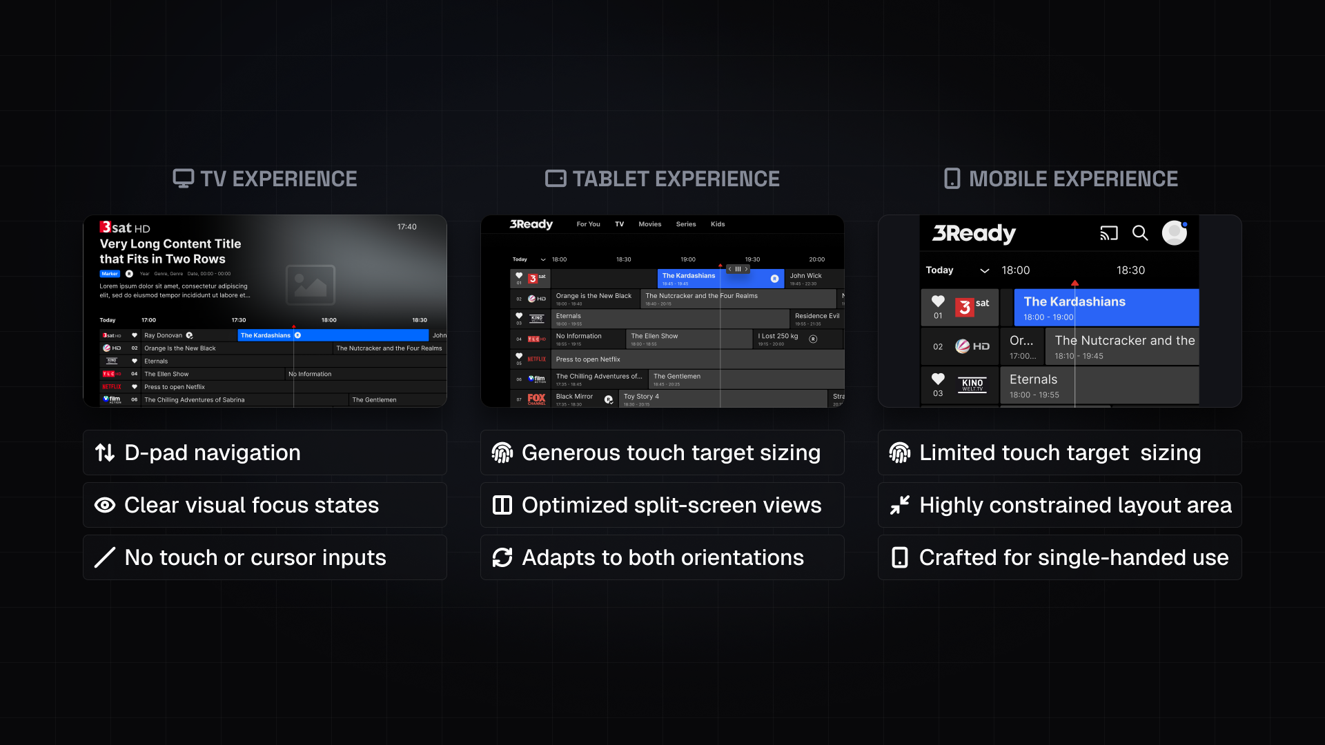
Designing the Electronic Program Guide was not about adapting one layout to different screen sizes. It was about understanding how each platform changed the way people interacted with the feature.
Before locking the shared component model, I evaluated every platform against the same constraints. Those constraints became the framework for the decisions that followed.
- 1
Navigation
Mobile users navigate through touch. TV viewers use a remote and D-pad. Web introduces another interaction context. Every interaction needed a predictable result for the input method it was designed around.
- 2
Information density
An EPG encourages density, but phones cannot carry a TV-level schedule without compressing touch targets. The amount of visible information had to match what each platform could support accessibly.
- 3
Viewing context
Phones are viewed from centimetres away. Televisions are often several metres away. Typography, spacing, focus states, and visual hierarchy had to remain legible in both contexts.
- 4
Orientation
TV experiences are designed for landscape. Mobile and tablet support both portrait and landscape. Layout flexibility had to change with the device without breaking navigation or content hierarchy.
DIRECTION
Designing a reusable feature rather than seven isolated interfaces
The first major decision concerned what should remain consistent.
The EPG needed a stable mental model across every provider and platform: channels, a time-based schedule, program cards, current, past, and future content, program information, playback behavior, and selected and focused states.
Building seven unrelated interfaces would make the product harder to implement, review, and maintain. Reusing one scaled layout would ignore how differently people interact with phones, browsers, and televisions.
I designed a shared component model with platform-specific behavior.
Android TV and set-top box designs could remain closely aligned because both used Android-based foundations. Smart TV and Apple TV shared many remote-navigation principles while still requiring platform-specific consideration. Mobile platforms shared touch behavior, but screen size and accessibility requirements affected layout density.
The first implementation established reusable design and engineering foundations. Later providers could reuse those foundations while adapting channels, branding, and product requirements.
Rejected direction
Scale one interface across every device
Design decision
Share the EPG’s product logic and component structure while allowing interaction behavior and presentation to change by platform. Tradeoff: platform variants increased documentation and implementation work, but they produced more appropriate behavior for each input method.
DECISIONS
Four decisions that shaped the feature
The strongest decisions were the ones I could explain clearly. Each change existed because the platform, performance, or content model demanded it.
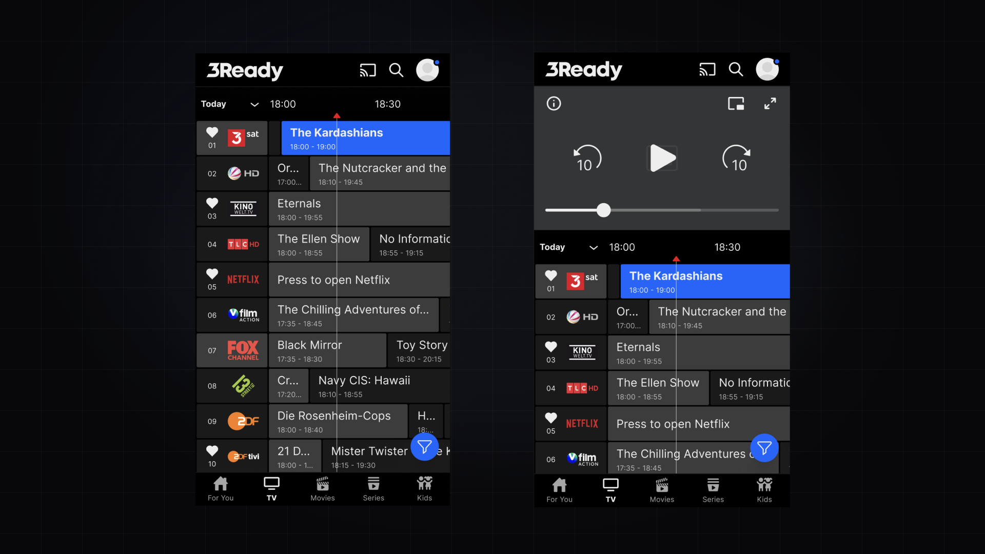
Decision 1: Protect touch targets instead of preserving schedule density
An EPG naturally encourages density. Showing more channels and more time at once can make the schedule appear more informative.
That density becomes difficult on a phone. Program cards, navigation controls, and channel rows still need large enough touch targets to remain usable and accessible.
I reduced the number of visible channels on mobile rather than compressing the TV grid into a smaller screen. This gave each interactive element enough space and kept the schedule readable.
I did not create a denser mobile alternative because it would have required touch targets below the minimum size I was prepared to use. Users could browse additional channels through vertical scrolling. The design exposed less of the schedule at once, but each visible item remained readable and actionable.
Decision: Reduce visible schedule density on mobile. Rejected direction: Preserve TV-level density by shrinking program cards and touch targets. Reason: Smaller controls would weaken accessibility and make the grid harder to use. Tradeoff: Viewers saw fewer channels at once and needed to scroll more.
Decision 2: Let focus define priority on TV
On touch devices, users can select any visible control directly. A TV interface works differently. One element must always hold focus, and every D-pad input needs a predictable result.
This changed how I treated primary actions. On TV, the action that receives focus when a page opens appears primary. Once the viewer moves elsewhere, the focus moves with them and the original action should no longer retain the same visual emphasis.
The interface therefore could not depend on a permanently styled primary button. Visual priority needed to follow the active focus state.
The EPG also required predictable directional movement: left and right moved through the schedule, up and down moved between channels, focus states made the selected program visible from viewing distance, selecting a currently available program could start playback, and selecting a past or future program opened its details without immediately playing it.
Decision: Make visual priority and action state respond to TV focus. Reason: Remote navigation changes which action is currently available to the viewer. Tradeoff: The design required more states and documentation than a static hierarchy.
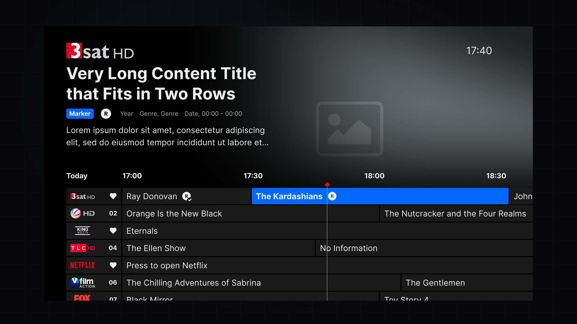
Decision 3: Use explicit day controls to protect performance
The EPG needed to load a large amount of schedule data. Automatically loading and switching days as viewers reached the edge of the timeline would have created a smoother interaction, but it also increased the amount of data the product needed to manage.
My preferred direction was continuous scrolling with automatic transitions between days. Performance took priority.
We added explicit Previous Day and Next Day controls. When viewers reached the current day’s boundary, they could choose to load another day rather than causing the interface to fetch and manage the next schedule automatically.
The extra action made the transition less seamless, but it gave the system a clearer boundary for loading data.
Decision: Require viewers to select Previous Day or Next Day. Rejected direction: Automatically move between days through continuous schedule scrolling. Reason: The explicit controls reduced the performance cost of loading and managing large schedules. Tradeoff: Moving between days required an additional action and interrupted continuous browsing.
This decision taught me to treat performance as part of the user experience. A smoother interaction has little value if it creates slow loading or unstable behavior across lower-powered devices.
Decision 4: Design the timeline for unreliable content shapes
Program data does not arrive in uniform blocks.
Some broadcasts last only a few minutes. Others continue for hours. Some channels stop broadcasting overnight. Content can be unavailable, missing, or locked.
The timeline needed to work across those conditions without losing the program name or making the viewer’s position unclear.
Long broadcasts created a specific problem. A program card could extend beyond the visible timeline, causing its title to disappear as the viewer navigated through time. The design needed to preserve enough identifying information even when the full program block did not fit within the viewport.
The feature also needed to distinguish between different content states: a current program could begin playing when selected, a past or future program opened its details, locked content needed a distinct state, missing schedule content could not break the timeline, and channels without overnight broadcasts needed to remain understandable.
These edge cases became reusable additions to the internal design system after the first implementation.
Decision: Treat unusual schedule data and content states as core component behavior. Reason: The EPG had to remain understandable regardless of program length, availability, or access. Tradeoff: Supporting the full range of states increased the component system’s complexity.
Documenting shared rules and platform differences
I used existing foundations from the internal design system, then added new EPG components and states after the first implementation exposed the required edge cases.
I documented the components in Figma and Confluence, including their properties, variables, interaction states, and platform-specific behavior.
This documentation helped distinguish three layers: shared EPG concepts and components, platform-specific interaction behavior, and provider-specific branding and content.
The separation made later implementations more efficient. Teams could reuse the underlying logic without treating every provider as a copy of the first one.
Testing implementation on physical devices
The QA team tested the EPG across physical devices. I also conducted design QA on each platform.
Mobile and web builds were accessible from my laptop. TV platforms required a more deliberate workflow.
I installed builds directly on my television and used a capture card to bring the implemented interface back into Figma. I could then compare the build with the design, examine focus states and spacing, and document discrepancies for developers.
Set-top box and Android TV required the most attention because they relied on native components and platform-specific behavior.
This process helped me evaluate the experience under the conditions in which viewers would use it: on a physical television, with a remote, at living-room distance. Reviewing TV work only through desktop mockups would have missed important differences in focus visibility, scale, and navigation.
OUTCOME
Outcome
The EPG launched for Elisa, Allente, and TCC Uruguay across seven platform types: iOS, Android, web, Smart TV, Android TV, Apple TV, and set-top box.
The three providers had a combined customer base of more than 4 million people across Europe and Latin America. This figure represents the reach of their products, not confirmed EPG usage.
The first implementation also created reusable components and engineering foundations for later providers. The teams could adapt the feature to different channels, branding, and requirements without designing or building it again from the beginning.
Because the client retained product analytics and user-research responsibility, I did not receive usage, engagement, or usability results after launch. The confirmed outcome is therefore shipment and reuse across providers and platforms, rather than a measured improvement in viewer behavior.
3
Providers that launched the feature
4M+
Combined customer base across providers
7
Platform types the feature shipped on
REFLECTION
Reflection
This project taught me to treat multiscreen design as a system of technical and interaction decisions.
The most demanding part was not arranging channels on different screen sizes. It was building a model that could handle seven platforms, several input methods, unpredictable schedule data, native components, performance constraints, and different provider identities.
I am most proud of the way we addressed edge cases across platforms. Long broadcasts, unavailable overnight schedules, locked content, focus behavior, playback rules, and day transitions all needed to work without making the feature feel fragmented.
The project also made me more attentive to technical constraints. My preferred interaction for switching days would have felt smoother, but it created performance risk. The explicit day controls were the more responsible product decision.
If I approached the project again, I would ask to participate in user research rather than receiving its conclusions through the client. Competitor analysis, stakeholder knowledge, QA, and platform conventions gave us a strong implementation framework, but direct observation could have revealed how viewers understand schedules, decide what to watch, and move between browsing and playback.
There will always be schedule combinations we have not anticipated. I would continue monitoring real content data and expand the component rules as new edge cases appear.